Top
J.
J.
Designed by
Website artboard

Talking Therapy


Aida Hernandez is a New Jersey-based licensed therapist with a growing practice. She is focused on growing her practice, Colibri Consulting, and expanding her reach through an SEO strengthened and user enriched website.

Our focus is to connect Aida Hernandez’s existing and growing client base with a modern and responsive website experience that matches the needs of her diverse clients made up of adolescents, young adults, and parents.

Role:

UX/UI Designer

Time:

4 weeks, 80+ hours

Stakeholder:

Aida Hernandez

Empathize section
 

Understanding the User

To strengthen my understanding of what clients look for in a therapist, I conducted user interviews with participants that represent Aida Hernandez’s target audience. This included the perspective of five women of color representing Generation Z and Millennials.


User Interviews

Users and Audience

The goal was to know what potential clients consider, their objectives, motivations and concerns when seeking therapy. My research questions were open-ended and meant to be conversational given the personal nature of talking about therapy.


Objectives:

To identify if Aida Hernandez’s website needs additional updates or information highlighted to successfully cater to potential clients.  

  • Determine what users want to learn about therapy or specific services.

  • Determine what users are looking to know about their potential therapist. 

  • Determine what users are looking for prior to booking a consultation.

  • Determine what questions users have when visiting a therapist’s website.

  • Understand what methods users use to navigate and find a therapist.

  • Understand the user(s) and job(s) to be done to identify potential tasks that are higher priority.


Insights

Participants provided feedback about the pain points they experience when planning art events and suggested features to make their planning efficient.

Pain points:

  1. Participants don't only want therapy.

  2. Culturally unaware therapists.

  3. Inability to book online or via text (easier forms of connecting).

  4. Unable to see availability or connect schedules.

  5. Not having their questions answered — having to dig for the information.


Priority:

  1. All participants confirmed the importance of having a culturally competent therapist. This included an ability to have an understanding of different age groups. Many expressed a need for a therapist that was a POC, and woman.

  2. Participants want to see responses to their FAQs (see above), resources, contact information, availability, an biography/introduction (see your "vibe" but not just text), "more storytelling, not blogging," "has to look modern," and possibly testimonials/reviews.

  3. Participants shared that making a decision to book a session would be made easier with the following:

    1. Telehealth services

    2. Calendar of Availability

    3. Various contact methods (text, email, call)

Takeaways

When it comes to setting up an appointment, timing is of the essence. Many people seeking therapy are doing it when things are at a low and having a site that allows her practice to facilitate booking consultations is key for her clients.

Define section
 

Determining Options

The interviews revealed that although their reasons for seeking therapy may be different, the participants overlapped in their need for information that connected them to the therapist, flexible session options, clarity on insurance coverage and pricing, easy booking and contact options and resources beyond traditional therapy.

The persona created is a combination of the themes that arose in the interviewees frustrations, goals and motivations. Illustrating these statements and persona would allow stakeholders to connect to the potential gap this application would fill if brought to market.


Persona

Ximena is a rising star at her education non-profit job where she is a Program Manager. She is always on-the-go and enjoys a busy schedule of activities outside of work too. When she’s not working out, she’s planning a hangout with friends. Part of her must-have activities on her list is self-care. Given her profession, being a POC and the affects of 2020-now, she has reached a point where taking care of herself is a top priority. Her goal is to find a therapist that is preferably a POC (and at the very least culturally competent), meets her needs (specialty, education, background), provides Telehealth sessions and can accept her insurance.

Frustrations

  • Going through hoops to schedule

  • Having to be in-person for sessions

  • Not having a support system

  • Being misunderstood and overwhelmed

Goals

  • Specializes in anxiety & depression

  • Does Telehealth and texting

  • Flexible scheduling

  • Accepts insurance

Motivations

  • Listening to others’ journeys

  • Music playlist for her mood

  • Trying new workouts from home

  • Keeping up with mindful influencers on Instagram and TikTok

 
Ximena's jobs to be done statement.

Jobs to Be Done statement

Ideate section
 

Brainstorming Solutions

Site visitors would have a need to gather as much information from the landing page and navigation wouldn’t require complicated sitemap or information architecture.

As a result, the focus would be on making the process to book a consultation as easy as possible by providing multiple opportunities for users without the design being overwhelming.

 
User flow

User Flow

Sketches

I brainstormed ideas by doing the Crazy 8’s activity to come up with sketches that combined a modern look for a therapist’s website but also provided the needed information.


User Flow

In order to book a consultation, I considered the paths users would follow and questions they would ask themselves as they progressed through the website. The corresponding user flow reflects the pages, possible actions and outcomes until a consultation is booked.

 
Crazy 8's sketch exercise

Crazy 8 Sketches

Next Steps:

The user flow informed me that less is more when it came to pages; however, paths to book a consultation, would require many subtle opportunities.

Prototype section
 

Simulating User Experience

Wireframes

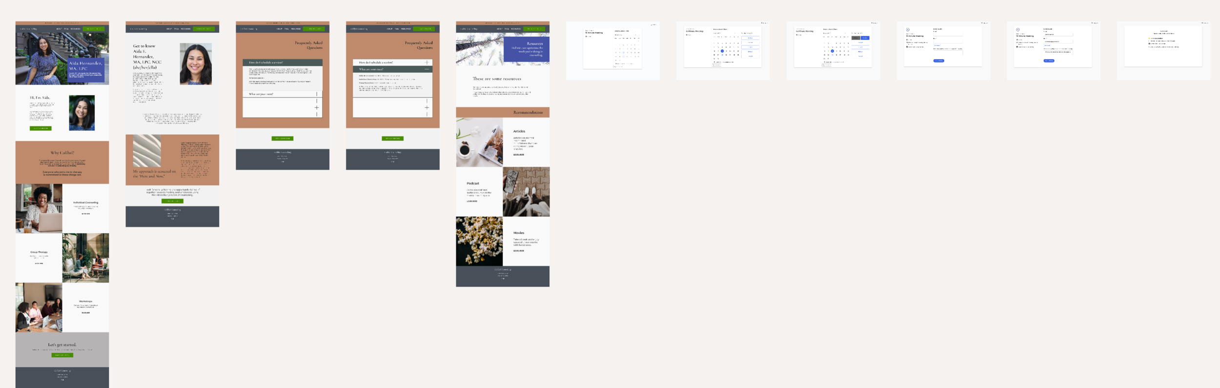
I created wireframes that elaborated on the paper sketches and with each version providing a different layout and color palette.

Version 1: Starts with an announcement bar that is followed by a hero with a text box that introduces the therapist. The navigation bar does not have a solid background. The hero is followed by text that further describes Colibri Counseling’s practice and services. The page wraps up with a call to action and footer.

Version 2: Starts with an announcement bar that is followed by a hero with a text box that introduces the therapist. The navigation bar has a solid background. The hero is followed by text that introduces the therapist. However, this layout differs in its demonstration of what services Colibri Counseling offers. The page wraps up with a call to action and footer.

Version 3: Starts with an announcement bar that is followed by a hero with a text box that introduces the therapist. The navigation bar is in a solid background. The hero is followed by text that further describes Colibri Counseling’s practice and services but does it by breaking up the text with a different layout. The page wraps up with a call to action and footer.

Wireframes for each version

Wireframes


Prototype

Version 2 prototype

Version 2 Prototype

I selected Version 2 as the user flow that participants will test when visiting the website. The prototype focused on users viewing the landing page for information on the Colibri and its services. This was then followed by the user viewing the About, FAQs and Resources page before deciding to book a consultation. The tasks looked to provide a path that not only mimicked the user flow but also would convey any gaps or opportunities within the page.

Test section
 

Validating with Users

To test the effectiveness of the user flow and website design experience, I conducted two rounds of unmoderated usability tests using Maze. The participants for the first-round were part of my network while the second-round were recruited using Maze. I did this to get a more robust pool of responses that were not familiar with the therapist or UX principles.

Usability Test


Test Objectives

  1. Identify and improve Aida Hernandez’s website experience through the following steps:

    1. Find the tasks needed to complete in application.

    2. Book a consultation with the therapist.

    3. Locate services, about, faqs and resource pages.

    4. Identify pain points and potential opportunities.

Test Details

  1. Participants will be chosen to test the UX/UI of the website.

  2. Remote, unmoderated: I will have the participants complete tasks using Maze.

  3. Participants will attempt to complete a set of tasks.

  4. Target audience: 18 - 40 years of age, All genders


Affinity Map

Affinity Map

The Affinity Map provides a synopsis of the successes, concerns, observations and suggestions participants shared organized by themes. The topics were narrowed down to reorganizing the content, layout and UI. It also highlighted some feedback the therapist hadn’t considered before, like video content, and establishing a stronger social media presence.

Prioritization Matrix

The suggestions I prioritized were:

  • updating the landing page to include costs of services.

  • changing the button and overall site UI to be color coordinated and accessible.

  • rearranging the subsections to highlight the information users prioritize.

  • connecting each button to the corresponding links to book appointments through a HIPAA compliant partner.

Prioritization matrix

Prioritization Matrix


Outcomes

Even after reviewing and updating Aida on the usability test results, we collaborated to confirm she was comfortable with the changes I was recommending based on the feedback. As my stakeholder, Aida’s thoughts and approval were important to make the final result a success. After changes were implemented, she would review the page versions to see which she felt best conveyed her brand and felt the most accessible.

 
Takeaways section
 

Reflections and What’s to Come

This project was a great experience in working with a stakeholder to create a website design that incorporated user feedback while also balancing their (stakeholder’s) goals. It was great to see Aida be receptive to the importance of accessibility and rearranging/deleting content that she may feel is important but may lose her client’s attention.

The next steps will focus on fine-tuning her SEO, connecting her Google analytics, bridging her socials with her website and finally, adding a resources section. Each of these items will strengthen her website and help to drive more traffic. It’ll also help her make better informed decisions about the content on her site.