Top
J.
J.
Designed by
Mockup of the Zara feature on three mobile screens.

Returning Purchases Efficiently


This project required that I add a feature to an existing product on the market. I selected Zara based on the assumption that customers were unhappy with their online shopping experience.

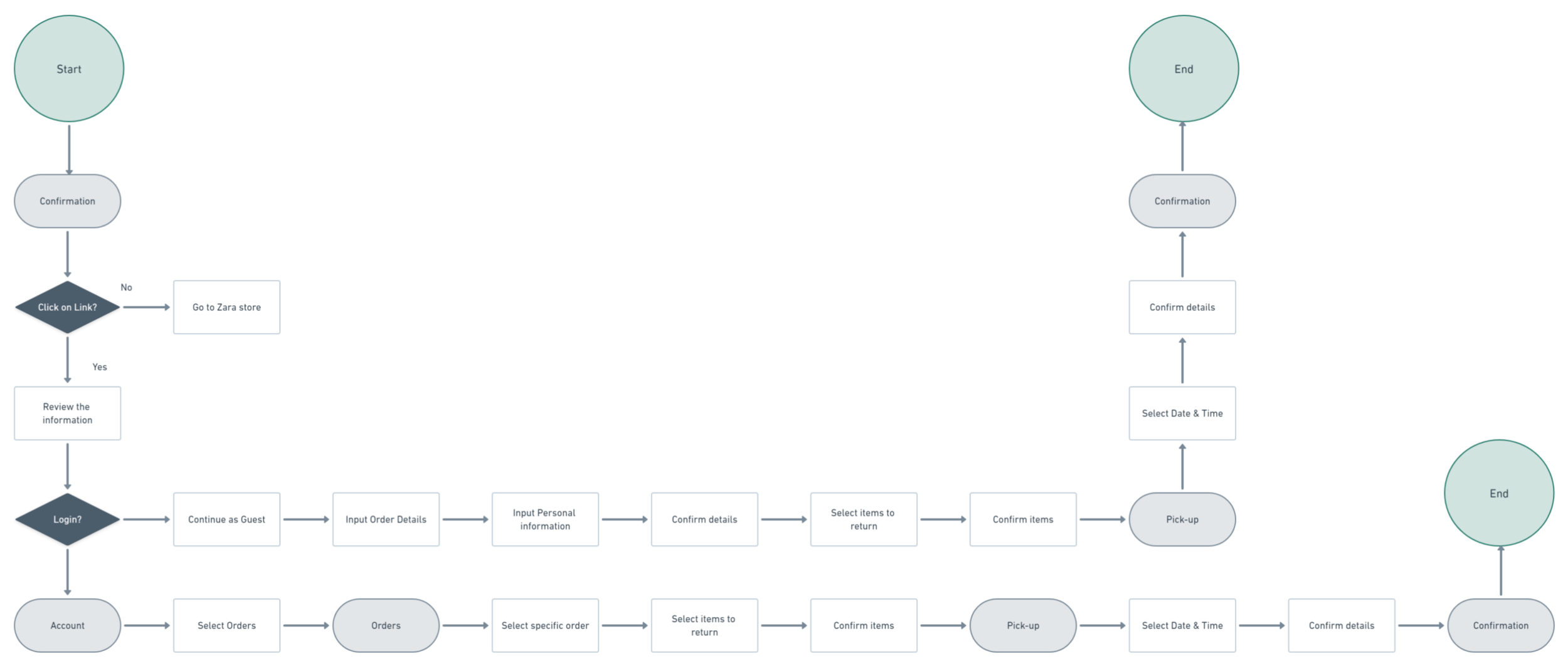
Research revealed that although customers had several pain points when dealing with Zara’s online experience, their main issue was returning items that didn’t fit. This led me to wonder what possible features could be created to address returning without the hassle.

Role:

UX/UI Designer

Time:

4 weeks, 120+ hours

 
Empathize section
 

Understanding the User

My Own Constraints

As a customer and frequenter of Zara, I understood some of the challenges users shared; however, I felt limited in my experience of how the e-commerce experience compared to the in-person experience. To remedy this issue, I tested the online user experience by doing a bit of my own research through children’s shopping. 

This provided great insight into the online shopping experience and unfortunately for me, also meant that I got to understand the pain point of needing to return/exchange an item.

What I learned from my field test is that there is indeed a gap in the e-commerce industry for return/exchanges to be managed in a more efficient way. However, to assure I wasn’t speaking for the average Zara shopper, I researched the market, and interviewed other shoppers.

 
Competitive analysis of e-commerce space and provisional personas.

Competitive Analysis and Provisional Personas


User Interviews

Users and Audience

The goal of my research was to understand how and why users make decisions to purchase products on Zara’s website, what competitors they consider and what would lead them to abandon their online shopping excursion. The participants were e-commerce shoppers, and Zara shoppers (the frequent, infrequent and for others). The interviews were conducted in person and remotely with five participants using Zoom, FaceTime, and Gmail. Through my interviews, I noticed a pattern with parents and items that didn’t fit their children. 

The interviews revealed that there was more to customer’s pain points than issues with branding and shopping, whether online or in-store. 

Themes

The participants’ responses had several overlapping themes. Their thoughts were organized into the importance of customization, the multi-faceted benefits of e-commerce and the pain points of dealing with shipments and returns.

  • Even though shoppers were frustrated with these experiences, they still enjoyed Zara’s products. 

  • Zara’s lead as a go-to for key children’s pieces can be up-ended by another e-commerce company that has figured out how to bridge the exchange/return gap.

  • Jobs to be done was to maximize customer’s time and minimize their costs by cutting down on and making returns/exchanges seamless.

Insights from user interviews on the topic of Zara.

User interview insights


Takeaways

Although returns and exchanges are not just a parents’ issue, I focused on this specific scope to hone in on time limitations and what that does for a user’s shopping experience. Shoppers, specifically, parents, were looking for a store that worked with them to not only dress their children for special occasions, but also for the everyday adventures of growing up. They need a store that can work with them to get the right sizes without the hassle of returning / exchanging to a local store.

 
Define section
 

Determining Options

After digesting all that information, I attempted to tackle the persona using the Jobs to Be Done perspective. Considering this was my first attempt at applying Jobs to Be Done, I figured I would run into some road blocks.

From the start, my assumption was not the main job that needed to be done; however, it led to a job to be done statement that would get to the heart of users’ needs.


Jobs to Be Done

When combined with my interviews, I came to the realization that Zara’s customers are looking for an experience that allows them to save on time and money by being able to return or exchange items without going to a store.

The theory also looks beyond the minimum job to consider secondary and tertiary jobs associated to what the user wants to achieve. In this case, the secondary job is to find items that fit well and tertiary job is to have a more customized experience on the site.

Jobs to be done statement and profile
 
Ideate section
 

Brainstorming Solutions

The Jobs to be Done statement honed in on Zara’s shoppers and specifically, parent shoppers as they are perusing the site for an item. To provide additional context for my Jobs statement, I developed a user journey and user flow that would convey the paths and possible expectations along the way.

This led to considering how would coordinating returns or exchanges from Zara’s site be represented as a new feature.


User Journey

Detailing the likely emotions and expectations the shopper using the new feature would feel as they go through the purchase, delivery, realization and exchange journey provides an opportunity to place stakeholders and other viewers in the user’s shoes. This allows me to consider how the shopper’s journey fuels the flow and subsequent wireframe.

User Journey

User Journey


User Flow

User Flow

Detailing the likely path users will follow to get their products returned or exchanged allows me to think through gaps or pain points that may arise along the way. This allows me to consider how the user’s flow may deviate and how it informs the subsequent wireframe.


Next Steps:

This project would require a feature that would allow users to schedule returns or exchanges from the comfort of their home. Given this task, I would need to create wireframes that would bring the feature to life while accomplishing the job. The challenging part would be designing wireframes that would be creative while maintaining the integrity of Zara’s brand.

 
Prototype section
 

Simulating User Experience

In contrast to other projects, I worked within the guidelines of an established brand and as a result, the creation of a moodboard, style guide or UI kit was unnecessary.

However, building out the wireframes, and prototype required a keen eye for following Zara’s design patterns and keeping their brand identity while innovating a feature that would be complementary to its sartorial elegant look.


Wireframes to Mockups

The wireframes focused on keeping the user flow in mind. With this, I kept in mind that the goal was to follow Zara’s design patterns while integrating a return / exchange feature.

In the image pictured, you see three versions of the same screen across iterations. Each with slight updates that capture Zara’s style while also integrating the new feature that would allow users to return or exchange purchases by selecting a pick-up date.

See the changes across each iteration.

Versions of purchase screen introducing feature

As I continued to work on the wireframes, they become higher fidelity mockups. You will see this in the iterations below as you progress through the iterations.

The color palette and design elements copied Zara’s simple yet refined look. In addition, I attempted to create language that would match Zara’s style of copy.


Prototype

With each iteration, the prototype came together to provide users with a path to test the new feature that would help to identify any gaps in the initial user flow and wireframes.


Test section
 

Validating with Users

The usability test allowed me to test the return / exchange feature, and gain first-hand knowledge from users with regards to how the feature would function. From participants’ feedback, I was able to create an Affinity Map and organize that into a Prioritization Matrix.

Nine users participated in moderated and unmoderated test conducted using Zoom, FaceTime, Figma and Maze.


Usability Test

Objectives:

Identify and improve the UX/UI of Zara’s return / exchange experience through the following steps:

  • Test overall usability of the feature.

  • Identify pain points and potential opportunities.

Details:

  • Participants: 9

  • Tools: Maze and Figma

Image of Maze's heat map during usability test.

Maze’s Heat Map

 
Affinity map

Affinity Map

Affinity Map

The Affinity Map organizes the user’s thoughts, experiences and suggestions about the new feature.

  • Include size change section

  • Add the Return / Exchange button in several locations

  • Add a navigation button to Zara email


Prioritization Matrix

The Prioritization Matrix organizes the suggestions based on their user value and effort to implement.

The changes included an order details page, size selection page, language that included exchange and return, email page with return button, and a summary page prior to a confirmation page.

 
Prioritization Matrix showing suggestions from usability tests.

Prioritization Matrix


Revised Prototype

Considering the suggested feedback from the usability test that would provide the most value but would require the least effort, I revised the prototype to include the following:

  1. Order Details - summarize the order

  2. Size Details - allows user to exchange item instead of only returning

  3. Selected Size confirmation - provides clarity on selection

  4. Order Summary - includes the summary of item, pick-up date and size

Revised prototype mockup

Revised Prototype


Looking Forward

These were additional suggestions that came out of the usability tests that require more effort and go beyond the feature enhancement.

  1. Collection days would be standardized days of the week or month that would be designated as days that Zara would have drop off or have pickups scheduled so that it is a much more efficient business venture for the company. This would cut down on the number of single trips to locations and bundle several pickups in an area.

  2. Reviews would be a way for additional customization for Zara’s e-commerce shoppers. If a customer has an account with Zara, they can sign in and see reviews and recommendations based on their previous shopping habits. As Zara builds a portfolio of the customer’s shopping behavior, it can provide a better shopping experience.

  3. Machine learning would add on to reviews by adding an additional level to the customer experience by providing different ways customers can customize their shopping experience, whether through more accurate sizing, product recommendations or time-based offer codes.

 
Takeaways section
 

Beyond the Return/Exchange

The greatest challenge during this project was not getting distracted with the other updates or changes were suggested during the testing of the feature. Although it would have been great to take on additional updates, it would have led me astray from the main job users wanted to accomplish.

It feels very relevant to working with a team when there will be priorities on what tasks can be accomplished more quickly or may take longer to create. It seems to inform how changes are considered when working with stakeholders and teams to create a new feature or update a product.

However, I am proud of my attempt at using JtBD to think about the shopper’s main need and how this theory can help to consider a product’s role in a user’s life. I’m also proud of my recreation of Zara’s UI as I created a new feature for their product.