Top
J.
J.
Designed by
Art board website mockup

Reimagining History


Zeit is a concept project from my Designlab bootcamp that is focused on developing a responsive website that allow users to book trips to discover the past through time travel.

Zeit is changing the travel industry by providing people with the opportunity to time travel. They are looking to do this through their product experiences, from their brand logo to their website. That is why they are focused on having a user-friendly experience that will attract users.

Role:

UX/UI Designer

Time:

4 weeks, 120+ hours

Empathize section
 

Understanding the User

Research was tackled using competitive analysis, and user interviews to learn more about the travel market, and target audience. The goal was to understand what drove users to decide on how and why to travel, who they consider for their travel and when booking travel.

Secondary competitors like train, bus and car rentals saw an uptick during the pandemic. In addition, Airbnb leaned on growing their digital experiences. 

 
Competitive analysis and provisional personas

Competitive Analysis and Provisional Personas


User Interviews

The interviews were conducted in person and remotely with three participants between 30 - 40 years old, representing diverse gender: (1) male and (2) females, marital status: (2) married and (1) single, and occupation: (1) hourly, (1) salary and (1) freelance.

Themes:

Competitors

Participants use local competitors and bundle their experience with those competitors to maximize experiences.


Safety

All shared that safety was key for planning a trip. This included an encrypted site, safe locations and experiences given the diverse population.


Consider

Interviewees considered reviews, places, activities for their travels, which would impact the trips offered.


Features

Interviewees offered suggestions from color palette, and all-inclusive bundles, to safety protocols.


Planning

Participants griped at having to plan or preferred to pass up the planning to another while being able to share trips or itinerary.


Experiences

Participants expressed that they wanted experiences that would appeal to different audiences.


Define section
 

Determining Features

At this stage of the design process, I looked to further understand the user by consolidating and analysing the qualitative data. This would be used to help to define the personas and empathy maps that would impact the information architecture, as well as the interactive and UI product experiences.


About those Feels

The Persona & Empathy Map were born out of the insights gathered from my user interviews where there was a focus on the following themes:

  • Experience that is secure and safe

  • Ease of planning and sharing

  • Ability to see variety in experiences

  • Multiple payment options

  • Unique experiences to share

  • Site that is user-friendly, clean and easy to navigate

  • Site must feel credible

So Why…

The Persona and Empathy Map are both steps taken to contextualize and actualize the interviewees. Simpler terms, it’s to consolidate and bring to life the perspectives’ of the interviewees -- what they think, care, feel, worry about when they are planning a trip. And that’s if they’re the ones planning the trip in the first place.

All that is bundled up in to a nice package for the stakeholder to then identify this qualitative data into a tangible being that requires their thought and concern so that this product focuses on their needs and solves the job they have for the product.

 
Ideate section
 

 Brainstorming Solutions

I kicked things off with a Card Sorting activity that would provide a structure for the website. We wanted participants to answer the question, “what does a travel site require?”

This would help to inform not only sitemap but also the path users consider when accomplish their happy path.


Type:

  • Optimal Workshop

  • Hybrid activity

    • Group items based on the boxes already provided or create new groupings

Activity & Results:

  • Diverse representation of gender, age, education and location

  • Participants - 9 total

  • Recruitment via Slack Groups

Options:

  • Sort 27 cards into 5 groups

  • Categories or Groups

    • Experiences

    • Menu

    • Company

    • Support

    • Account


Conclusion:

Account:

There were several items that were listed across multiple locations with minimal overlap for each of these sections: Account, Company, Menu and Support.


Support:

The cards that were most debated were the following: Travel Insurance, Cancellation Options, Sign up, Travel Plus, Packages, Terms & Conditions, Privacy Policies, How it Works, and About.


Menu:

Another observation was that many cards were also split between sections that will be together – i.e. Footer will include the Company and Support categories and as such wouldn’t be competing for cards that were split between them.

 
Account discrepancies in card sort activity
 
Support discrepancies in card sort activity
 
Menu discrepancies in card sort activity


Next Steps:

The Card Sorting results helped to inform the ideation for the site map, user and task flow, and sketches. The results showed that having items available in multiple locations would be helpful for users; and according to market comparisons, it would be smart to have access to topics across several categorizations.


The site map provides the foundational architecture for the site and how the information will be organized. This allows for a more intuitive navigation experience for users because it feels seamless. Given some contradictions in the card sorting activity, it was important that the site map took into account these discrepancies.

Site map

Site map


The sketches took into account the perspective of my persona, my card sorting activity and my non-traditional survey to narrow down the site layout. Overall, it was important that the search and experiences were front and center, along with being easy to navigate. In the end, I combined aspects of version 1 and 3.

Sketch 1

Sketch 1

Sketch 2

Sketch 3

Sketch 3


The booking task flow provides an outline of the expected user behaviour when they navigate through the website to book an experience on Zeit. Outlining this process allows us to consider success routes while at the same time considering alternative paths and gaps along the way.

Booking task flow

Booking Task Flow


Simulating User Experience

This part of the design process allowed me to bring a lot of the ideas to life from mockups, wireframes, high fidelity designs to interactive prototypes and brand identity.

Building out the prototype via paper designs allows me to iterate quickly, while also testing out what will work or fail with low cost effect.


Wireframes

My wireframes, the Landing page and the Experience page, came about from combining my site map, user flow, task flow, sketches and market analysis. On the Landing page, the Hero includes an image and a search bar as the main interactive piece. The Hero is followed by the Experiences section where the user will find trips, an Interactive Map, Testimonial and Travel Perks section.

Overall, the design of the pages remain the same across screen sizes. However, the layout changes slightly for the smaller screens. In addition, the tablet and mobile versions have more interactive features that are activated by touch. This includes features like swiping, and zooming.

 
Logo designs

Draft logos

Logo Design

I sketched out brand ideas for the logo and shared my designs with my team and then, with my mentor. I was not happy with the results but I continued drafting ideas.

I used Adobe Illustrator, a tool I recently learned to use, to come up with several iterations. I thought of time as a continuum of existing events that overlap. To represent that, I used overlapping circles and arrows. Through union, subtract, exclude, and intersect selections, I created new logos that led to my current logo.


UI Kit

Although time consuming, I was more efficient with my design process by creating a UI kit that included components I could re-use in my responsive design.

The components and color palette brought the pages to life while also cutting down on recreating designs.

UI Kit

UI Kit

UI Kit

Mockups


Validating with Users

I created a prototype in Figma and exported it to Maze to provide users with a usability test that can fit their needs. The usability test would allow users to go through the booking task flow from the landing page. The goal was to get users successfully book a Jazz in Harlem experience.


Usability Test

Objectives:

Identify and improve the UX/UI of Zeit’s responsive sites through the following steps:

  1. Test overall usability of the website.

  2. Figure out if users can complete the core tasks within the website.

  3. What can we learn from the steps that users take to complete tasks?

  4. Identify pain points and potential opportunities.

  5. How long does it take for a user to complete tasks?

  6. Are there any parts where users are getting stuck?

Participants:

  • 5 participants

  • Remote and in-person

  • Moderated and unmoderated

  • Ages: 22 - 40 years old

  • Travel enthusiasts

Goals:

  • 100% Error-Free Rate

  • 100% Completion Rate


Affinity Map

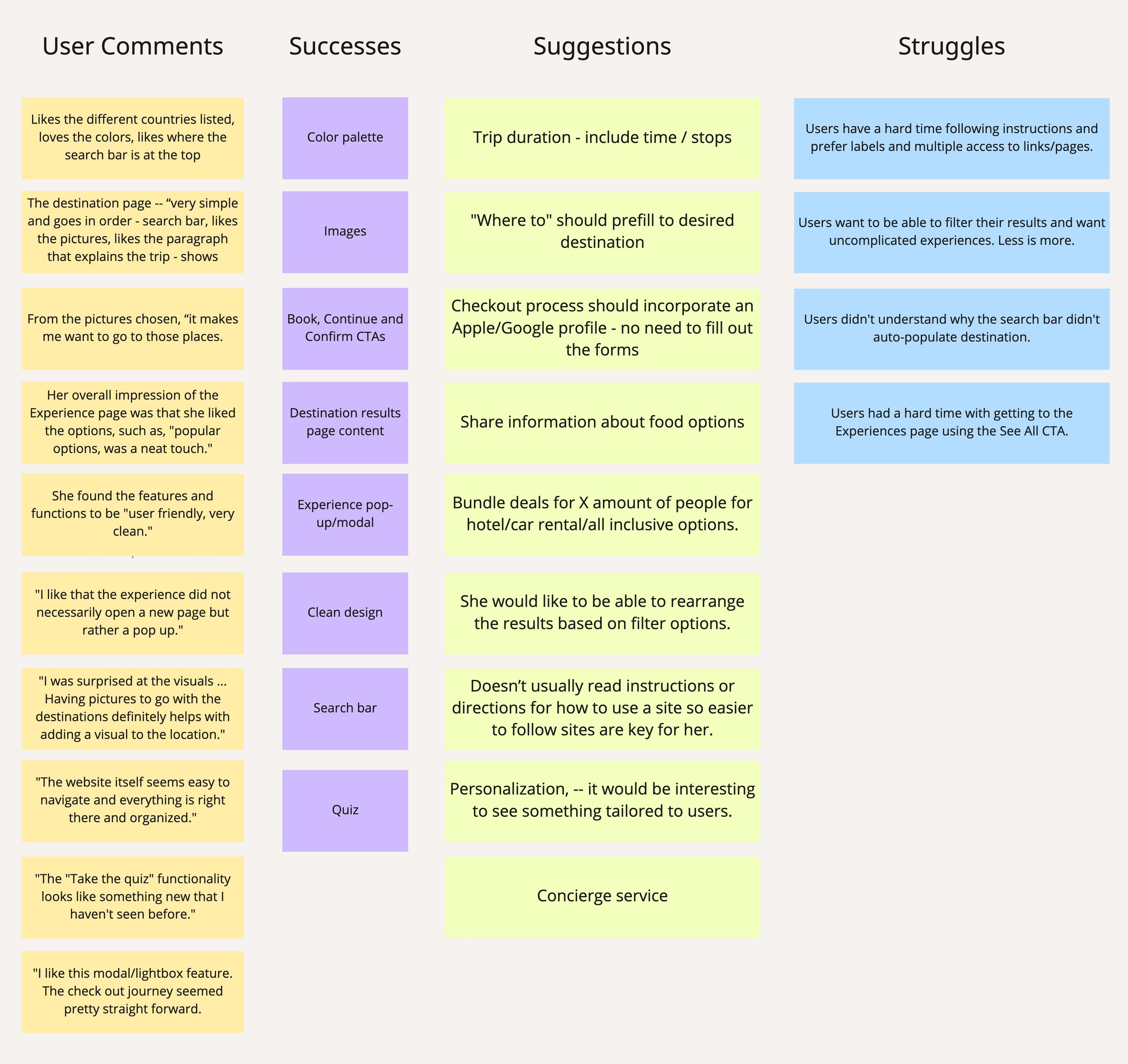
The affinity map represents the results from my testing and conveyed what I would need to prioritize in my updates.

Affinity Map

Affinity Map

Challenges:

  • Users had a hard time understanding content

  • Add auto-populate search bar

  • Lack of multiple entry points

  • Lack of filter options

Successes:

  • Clean design

  • Easy to use and navigate

  • Interesting features

Suggestions:

  • Engaging content & copy

  • Add auto-populate destination

  • Filter results

  • Personalized experience


Prioritization Matrix

I focused on tasks that would be high in value to users but low in effort. This meant that I would be auto-populating destinations, including more access points, and updating images, copy, filter and content.

Prioritization matrix that shows top feedback from the Affinity Map.

Prioritization Matrix


The Results

The new prototype took into account users’ feedback. Based on the prioritization matrix, I tackled the following:

  1. Providing multiple access points to increase exploration

  2. Adding relevant, engaging images and content

  3. Simplifying filter options

  4. Adding a share option and auto-populated destination


Before

After


Landing page

Revised landing page

Revised Landing page

Multiple access points

Participants were confused by how they could access the Experiences page and often overlooked the “See all” link.


Experiences page

Revised experiences page

Revised Experiences page

Relevant images and content

The site lacked a difference between any other competitor in the market, including images and content that reinforced its difference to the market would allow the site to standout to participants.


Results page

Revised Results page

Simplify filter options

The initial site had several filter options provided that did not make sense to include. Not only were they irrelevant, they confused participants.


Trip details modal

Revised trip details modal

Share option and auto-populated destination

When planning, participants are usually considering someone else’s opinion, a share icon and auto-populated destination would make it easy for them in making decisions.

 
Section starter
 

So what now?

Being this was my first project that followed the UX process from start to finish, it definitely took me a while to illustrate the process that delineates why I took the steps I did throughout it all.

Overall, I believe the design process seems linear but there is no linear approach when you’re taking into account your research because as you move through the process, you find yourself going back to iterate and implement your new ideas on your initial design. Through this experience, the design process feels like my Zeit logo, infinite in possibilities. Most definitely a work in progress!